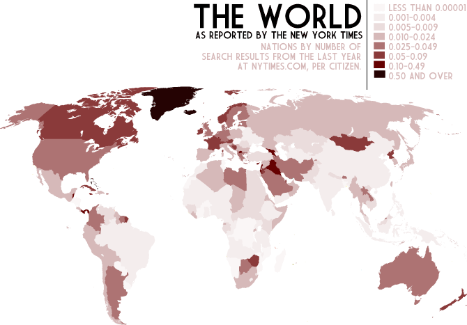
 Since we apparently only link NYTimes articles, I thought this might prove interesting. It's a map displaying Times stories per capita for the last year.
7.23.2008
Mapping the Times
Since we apparently only link NYTimes articles, I thought this might prove interesting. It's a map displaying Times stories per capita for the last year.
Subscribe to:
Post Comments (Atom)


2 comments:
Greenland and Iceland. Really? Am I reading this wrong?
I'm not even going to look at that map. It's not a Peter's Projection. Stop being racist.
Post a Comment